Functionality Improvements in NAV 2015
Microsoft Dynamics NAV 2015 was released a couple of weeks ago. I have download and installed it and so far it seems like it can co-exist with Dynamics NAV 2013 R2 without any issues (which was not the case with my 2013 and 2013 R2 versions, so this is great).
To me the improvements that the users will see (e.g. the functionality in the NAV clients) are the most important ones (and also the most fun to review). The improvements of the technology behind the scenes (such as OAuth support for web services, merge utilities, multi-tenant architecture, etc.) are also important but of less interest to me as a business consultant. Therefor I will simply ignore those in this post. 🙂
At a first glance the client does not look that much different from the 2013 R2 version, but there is some new very useful functionality that looks promising. I have browsed through it and below are my first thoughts about some it.
Mandatory Fields
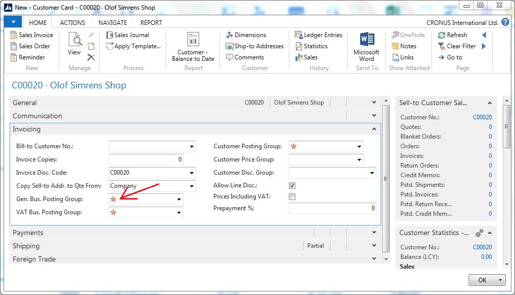
This is part of the user experience simplifications that Microsoft has done to NAV 2015. It marks mandatory fields that are empty with red asterisks.
This is a great feature and something that users often ask about (or at least they ask what fields are mandatory). In the earlier versions (before the role tailored client and pages) it was common to make mandatory fields different colors to simplify the data entry for the users. I am happy that an option to indicate mandatory fields is back and now part of the standard functionality.
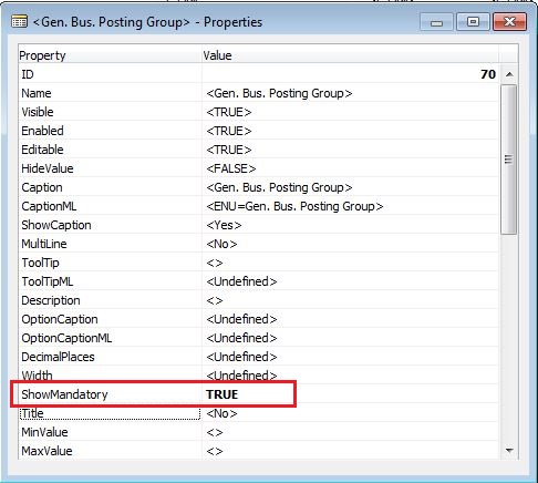
The property that controls if and asterisk is going to be displayed or not is called ShowMandatory and it is an option that is on the fields of the pages (does not seem to be available in tables for some reason).
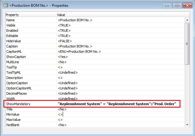
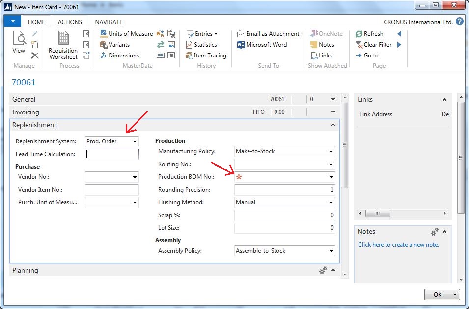
Like many of the other Boolean properties this can have a value of TRUE, FALSE, a Boolean variable or a condition. This is very useful since if fields are mandatory or not could depend on what type of record it is. You can for example say that the Production BOM No. field on the Item Card is mandatory for items where the Replenishment System is Prod. Order, like below.
Now when the user changes the value of the Replenishment System the red asterisk shows up. Nice! 🙂
Overall a great feature I think!
E-Mailing
Another new feature that is asked for all the time is the ability to e-mail documents such as order confirmations and invoices directly from Dynamics NAV. In prior versions this has always been through custom programming (one of those things that each of us that are implementing NAV had our own little ‘hack’ that was used) or you simply purchased an add-on.
Now this is finally standard functionality and it will save lots of discussions about why it is not there from the start with during implementations.
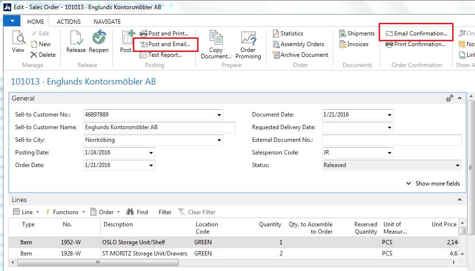
The functionality is available through the ribbon on the different documents, below example shows the Email Confirmation and Post and Email action items on a Sales Order.
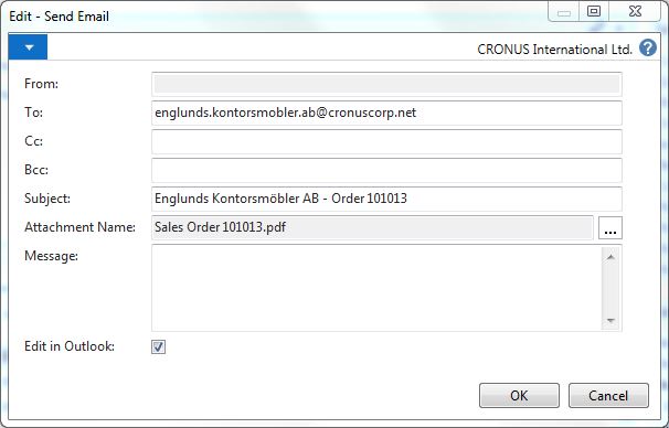
Clicking the Email Confirmation button opens a dialog from where the e-mail can be sent directly or moved into an Outlook email. Note the printout attached as pdf file.
The e-mail address for the customer comes from the Customer Card, the subject seems to be hard coded and the body is something that I think needs to be customized to default to something (haven’t seen a setup where this can be defined, not a big deal).
The functionality is in codeunit ‘9520 – Mail Management’ and table ‘9500 – Email Item’, it all seems straight forward and reusable if required in other areas and/or with modifications.
This is great! The only thing that seems to be missing is the Post and Email Batch. I guess that is something you will have to program yourself. 🙂
Auto-fill No. field
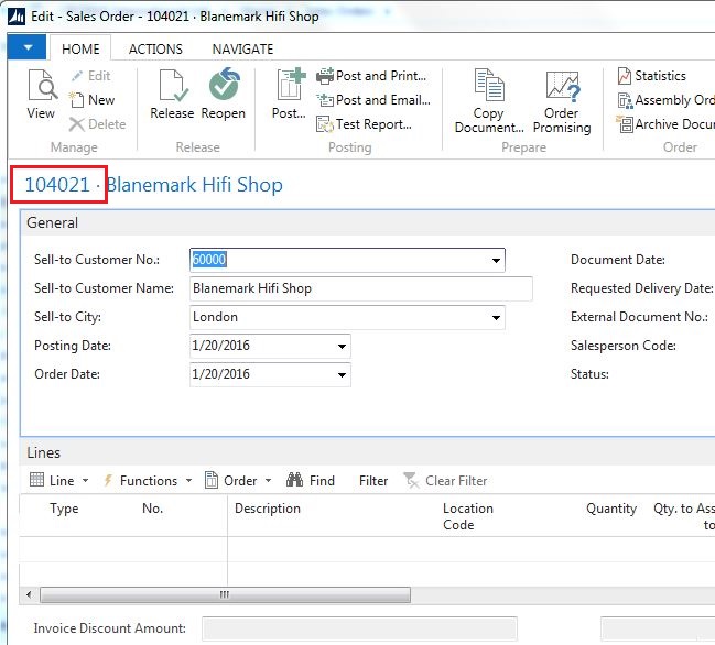
The Auto-fill no. field feature removes the number field from the page and moves it up to the caption bar. This eliminates the need from hitting TAB, TAB (or just moving away from the No. field) when entering things like orders. Not a big thing, but at least you don’t need to explain what the button next to the No. field is used for anymore. 🙂 And it will be slightly quicker to enter an order.
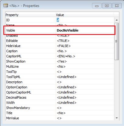
The functionality for this simply uses the Visible property for the No. field and some code on the page to determine if the field is going to be visible or not. Quite straight forward and clever I think.
Totals on Documents
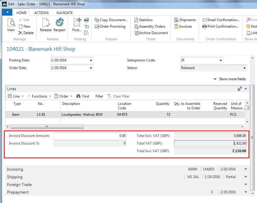
Totals have been added to documents, this is great, it should have been added long time ago.
Everybody wants to know the total of an order without having to hit the statistics or doing a print/preview. I have had to do customizations to show this before (through FactBoxes etc.), now it is there as standard which is great! This feature is also part of Microsoft’s attempt to simplify the user experience with Dynamics NAV 2015.
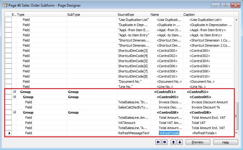
If you look close enough you see that the total part is not a FastTab, it is actually part of the lines. In the object designer you will find the new totals section on the subforms pages (yes, it is funny that they are still called subform, should be subpage now that the forms are gone 🙂 ).
Simplified UX Pages
Simplified UX (not AX 🙂 ) is a set of new pages that are simplified (as the name suggests 🙂 ), in the object designer you see them in the 1300 range and they are all named as ‘Mini Customer Card’, ‘Mini Item Card’, etc…
A way to run Dynamics NAV based on those simplified pages is to setup your users to use the ‘SMALL BUSINESS Profile’, and then your role center will have all those simplified pages. It supposed to cover the basic sales and purchase scenarios for smaller businesses, something like companies with just a few users doing basic business transactions. I my mind this was something that was common years ago when Dynamics NAV (back then Navision) came with a native database and server and it all could be installed and configured in two days. With the simplified pages it seems like Microsoft wants to go back and start targeting those small companies again, most likely through a hosted solution where the installation is not necessary.
To me it is a bit strange that it comes as a separate set of pages instead of just configuring the standard pages to include minimal fields and functions, that was what I thought the Role Tailoring and profiles was about. But, when you start looking at the simplified pages you see that they are more than just a set of new pages where fields and actions has been removed, they also have some additional functionality to them. Here are four examples:
1. Subpages on Master Data Cards
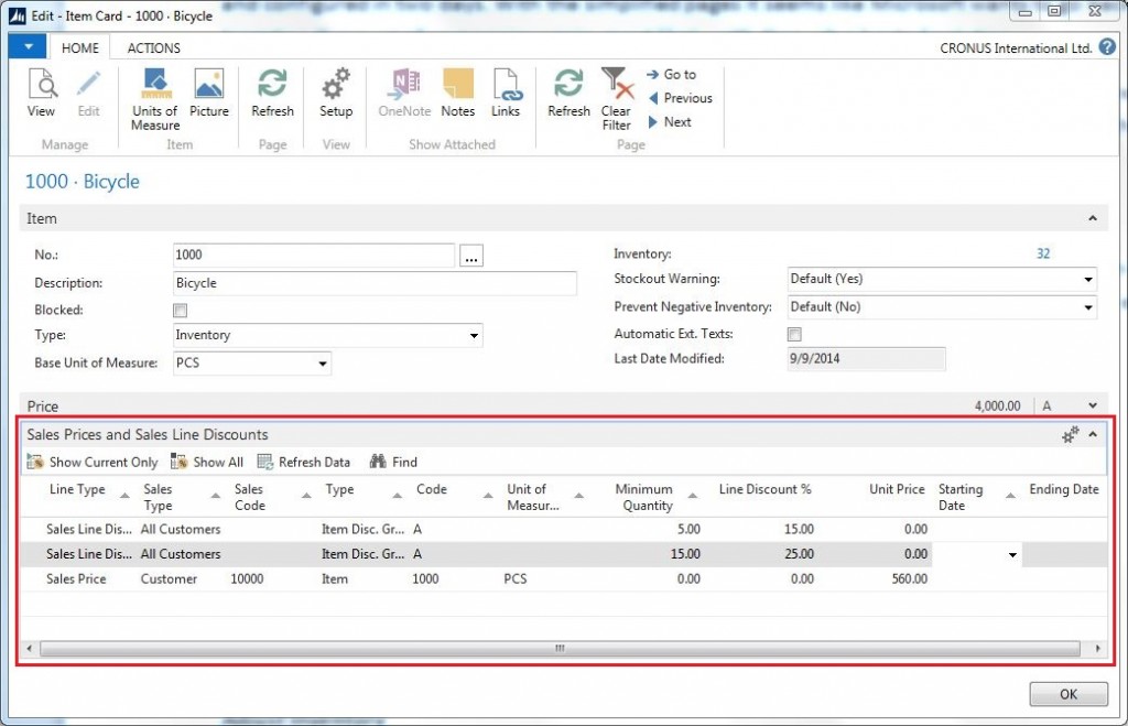
Some of the master data pages has subpages that displays records from another tables. As an example, the Item Card has a fast tab called Sales Prices and Sales Line Discounts where the user more easily can maintain the prices and discounts for the item. Interesting that both the prices and discounts has been put together in one page.
2. Templates for Master Data
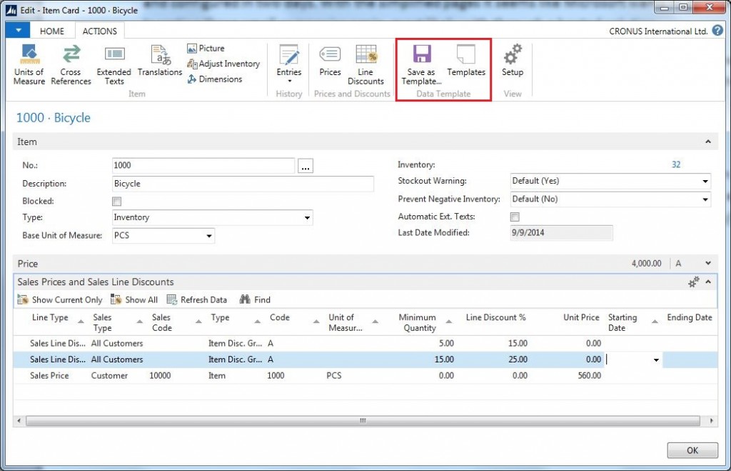
A master data record has the option to be saved as a template and used when creating new records. The action pane provides this functionality through the Save as Template and Use Template functionality.
3. Cancel or Correct Posted Invoices
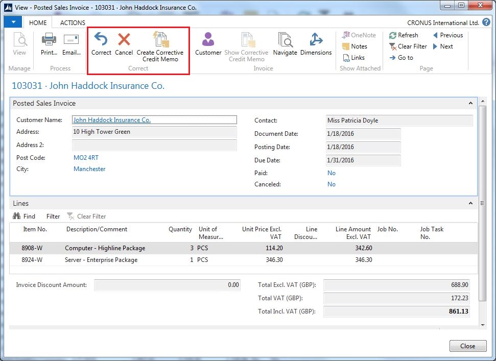
Posted sales and purchase invoices has functions to Cancel or Correct (and also to just create a corrective credit memo that is a copy of the posted sales invoice). The cancelling option will simply create a credit memo and post it automatically, while the correct option will cancel the invoice the same way as the cancelling option but also create a new invoice with the same information as the posted invoice so it can be corrected by a user and reposted. Some interesting functionality indeed; maybe something to also add to the regular posted sales and purchase invoices? 🙂
4. Adjust Inventory
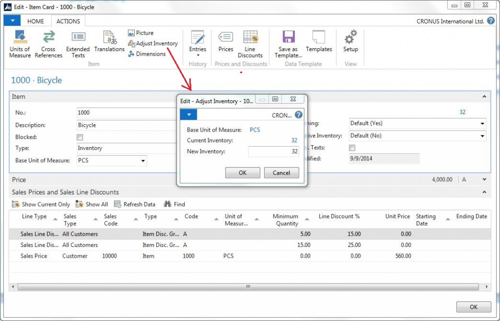
The item card has an Adjust Inventory action where the user can just enter the new quantity and Dynamics NAV will post a positive or negative transactions automatically to adjust the inventory accordingly. Almost too simple it seems like. 🙂 I guess a prerequisite is that you don’t use locations and bins or any other type of more sophisticated inventory setup.
UI Elements Removal
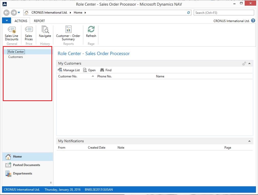
The menus in NAV 2015 can adopt themselves according to what you have access to. This almost feels like it is a version 5 feature that comes back. Not bad. I think it adds a lot of value, users quite often find themselves lost in the menus (even if the new search feature that came in NAV 2013 has improved it a lot).
Cues
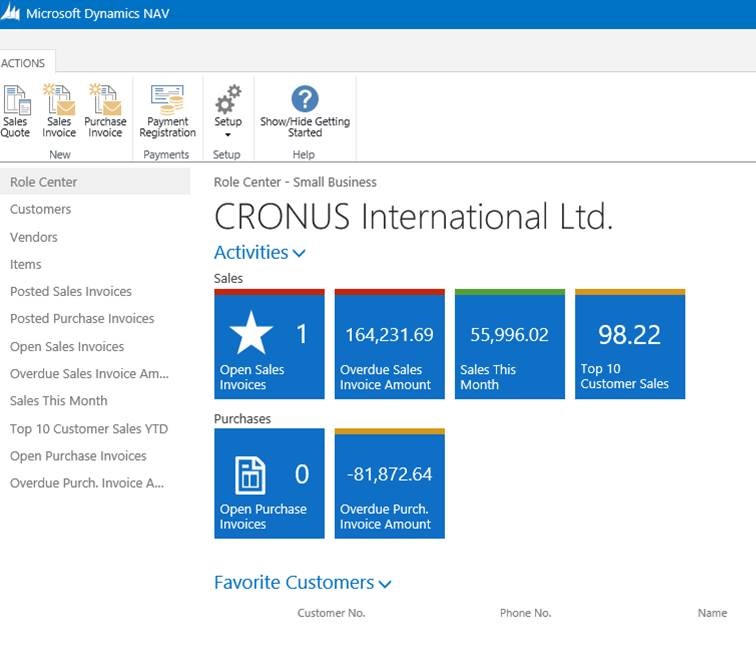
The cues has been enhanced a bit, they now have an indicator that can change color based on the data values that are displayed. This provides a quick visual signal to the user.
The cues can now also show any type of values that are calculated when the role center is opened (not only counts of records). The font will automatically scale so that larger numbers are displayed with smaller fonts to fit in the cue and there are also a set of icons that can be applied to cues.
I have not been a big fan of cues in the past, but now maybe it is time to start using them, they certainly can provide value and be used to build a more dashboard liked role centers with KPI indicators. I rally like that they are more flexible to use now.
Faster Pages
The pages are also supposed to be faster in Dynamics NAV 2015. In my local install I don’t noticed a big difference, but maybe in a production environment there will be a difference, remains to be seen… Faster is always better!
Cash Management Improvements
Bank integration and electronic payments has been added as part of the standard functionality from Microsoft. I have not looked into the details about this but hopefully is supports some kind of standard bank interface so it can be used with multiple banks across multiple countries (which always has been an issue in the past when implementing multiple countries in a single NAV database since each more or less needed their own bank interfaces).
This might deserve its own blog post sometime in the future.
Tablet Interface
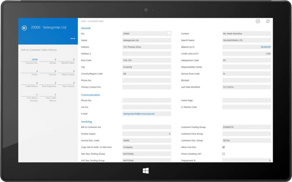
Then of course, we have the tablet interface. I haven’t had the time to play around with it but it is suppose to work with both Apple and Android devices (and Microsoft tables of course).
I see lots of potential application for this, not only as a dashboard for the president of the company but also things like a simple touch screen in production to report output and consumption directly on the shop floor. Or for registering warehouse transactions such as picks and put-aways, or as a retail interface in a store. It is indeed interesting to see what kind of add-ons that comes out for Dynamics NAV that will utilize this.
33 Comments
Leave your reply.